The VCI-100 NE (nintendo edition)

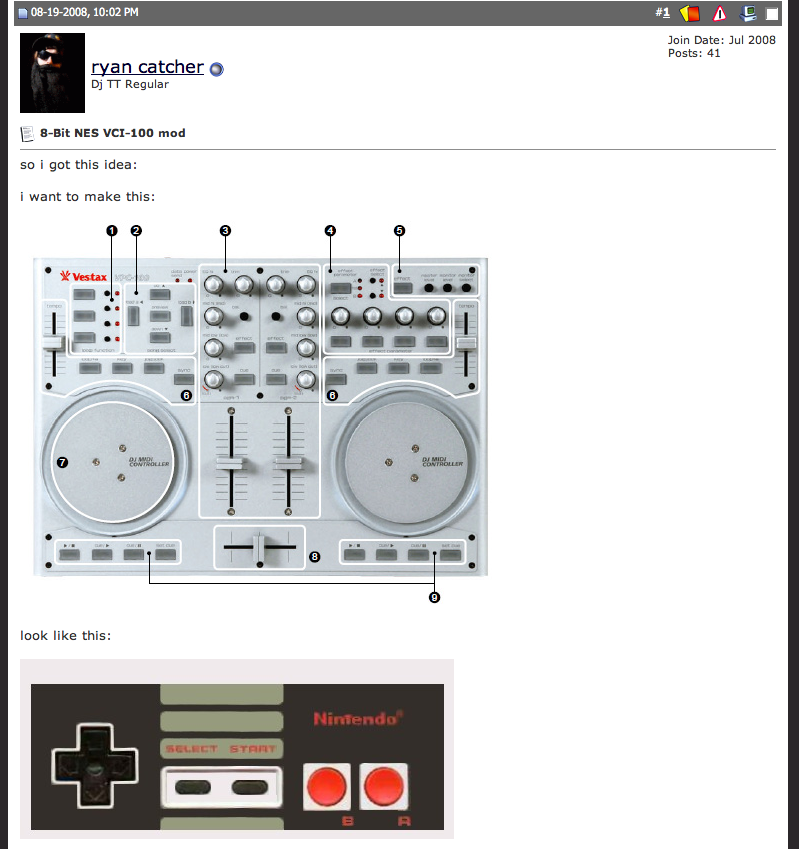
That conversation got started up in the forum about making a VCI-100 look like a Nintendo paddle. Little did the they know we have been working with several companies on creating some very high quality overlays for the VCI-100. The final product (available in about 4 weeks) is able to wrap around the top and sides of a VCI, changing the color and graphics to anything we want. These are not low-quality vinyl stick-ons but the same manufacturers that make durable, OEM overlays for products like Moog and Rane mixers. That means they will last forever and always fit on perfectly. So I told the Ryan, who started the thread, ” we can make that happen!” Since then one of our most frequent posters, Tekki and I have been working together on fine tuning the final design which has come a long way from the original concept.


So our questions to you:

  • Do you like it?
  • What would you change?
  • Would you want to get one?
  • Should it have the VCI-100 SE labels?

To give us an idea of how many to make, please answer those questions in the following poll.

http://www.djtechtools.com/forum/showthread.php?t=924

Editors Update: Thanks to all those that responded to the post. We love how interactive this site has become and the way that people jump and and include their take on the concepts. Here is an updated version with the input and feedback taken into account:

25 Responses to “The VCI-100 NE (nintendo edition)”


  1. 1 Chris combe

    awesome idea indeed :)

  2. 2 DJ G-R-Bs

    What a classic!

  3. 3 luigislaperig

    hey ean i alredy reply in the forum of what i tink but i do it again there a guy that post that the middle fadders shoul be white i think thats a good idea also the red on top thats going to be a bad color due to the visibility in clubs i kno u want to be rally similar to the nintendo controller but think in that too and also a better idea why u just dont do the top and the botton overlays with out the jogs is only because i hate the color red lol but is kool

  4. 4 Gregorious.

    I love the idea, but the layout is gonna be a tricky task. Maybe put the D-Pad in the left jog wheel, and make 2 even red buttons in the mid-section (where the 2 faders are) and the other button the jog wheel. I duno, just an idea!

  5. 5 tekki

    LoLz…. I am called a Ryan? ;)

  6. 6 Hooker T

    I like it, maybe change the color around the volume faders to white and the VCI 100SE labels are a must!

  7. 7 SOCIALPEST

    Nice ! I want one that looks like my Rane.

    I love the retro nintendo idea, however, along the way you seem to have lost the important design cue of the stripes - I think this is what would make folks recognize the link to NES. That said it does look sweet :)

  8. 8 dec

    lol @ the Ryan!

  9. 9 8-bit

    I like it. Definitely a white box around the channel faders maybe even with a fake painted in inset shadow. I’d like to see it with white boxes around the wheels.

    And 100% to the SE labeling.

  10. 10 DvlsAdvct

    I think the middle section should be white with black crossfader and volume faders.

    For the red in the corner, could you change the shade, perhaps? Make it a brighter red? Or, make it white and make the text black? That could be an interesting offset. The dark red over white could be offputting as well. Granted, when I’m spinning I almost never actually look there

    This would be great to have on my non-SE, though

  11. 11 screwtape

    hey i think it could be even simpler. it doesn’t have to be completely nintendo… just certain colours and organizations need to be there.

    also i think someone might of mentioned it…but the main bottom plate can remain stock grey

    …as well as some of the knobs and faders can be stock aswell to contrast the black plates. as opposed to having all the faders and knobs black.

  12. 12 AJ Orbit

    I cant wait for the Power Glove mod !!!

  13. 13 tekki

    PowerGlove…. w00t!

    (I think that has been done once, using a powerglove asa MIDI controller.

  14. 14 lost_poet

    nice idea!!!

  15. 15 DvlsAdvct

    That’s actuall not a bad idea, screwtape. Instead of changing all the pots to black why not keep em gray over the black background, or keep the background gray and change the pots to black? that might keep to the nintendo theme well, and be more striking than everything black

  16. 16 SchmirkScmigler

    getting closer.

  17. 17 screwtape

    ya i did a mock up… in photoshop. but i can’t post it…ill try to post it in the thread but not sure if i can.

    anyway ya keeping some parts grey…preserves the nintendo-ness.

    i like the over lays black…but the pots just need to contrast that.

  18. 18 screwtape
  19. 19 Pepe Jenkins

    Can you make one of these so that it looks like an 80’s ghetto blaster boombox? Perhaps similar to the lasonic or Conair boomboxes?

  20. 20 Gregorious.

    The Boombox idea is sick too!

  21. 21 Ean Golden

    Hey guys, I have been without internet for 3 days so thanks for all the great suggestions. We have updated the post with a new version.

  22. 22 Kimiko

    When’s the release?

  23. 23 Ean Golden

    about 3-4 weeks. We are testing them now.

  24. 24 Alex Byrne

    So Ean hate to be an annoyance but will they be ready for purchase soon? Im waiting to buy the overlay and the firmware together so theres less confusion visually when im getting used to the firmware update…

  25. 25 Ean Golden

    So Ean hate to be an annoyance but will they be ready for purchase soon? Im waiting to buy the overlay and the firmware together so theres less confusion visually when im getting used to the firmware update…

    We just approved the final designs and sent them off to the printer. They are telling us about 2 weeks now. Sorry for the wait but rather than rush things through, we want to make sure it will be perfect.

Leave a Reply

Quote selected text